Article
The Subtle Art of Good Taste
Building upon an incredible resume in media and design, Dara Caponigro is the editor in chief of Frederic magazine and the chief creative officer of F. Schumacher & Co. Her latest work leans heavily on the idea of “good taste” with a range of breathtaking textiles, wallpaper and paper goods.
Good taste is a slippery little fish. Like many of life’s ethereal plea- sures, it’s hard to define and hard to teach, but paradoxically, you know it – feel it, really – when you see it.
As a design editor and the creative director of a fabric company, I’ve spent my career documenting it, and it still flummoxes me. All the rules and stratagems eventually fall away, because once you set them in stone, invariably you encounter an example that proves the lie. “Good taste is form following function.” Yes, unless it doesn’t. Whimsy may be impractical, but it can also be very seductive – just Google the decorating of Tony Duquette (and try not to crack a smile). “Good taste requires quality materials.” Well, okay, but have you seen the wonders wrought by the likes of Le Corbusier and Louis Kahn with nothing more than run-of-the-mill concrete? “Good taste is execution with integrity.” Sure, but anyone who’s stumbled onto brilliance completely by accident – the heirloom cabinet you never wanted suddenly singing in the spot it was only supposed to be placeholding – knows that flying by the seat of your pants can sometimes be as revelatory as crossing all your t’s and dotting all your i’s.
In the end, what all my professional experience has yielded is respect for a certain kind of authenticity. Good taste is a room – a house, an outfit, an ethos – that is true to something: its owner’s character, interests or inclinations; a period or season, its time, its place. And since so much of that is subjective, what authenticity often boils down to for me is a sense of place. You may beg to differ with a color scheme, a curling cabriole leg, a ruffled, puckered sleeve or a predilection for Staffordshire spaniels, but you cannot argue with Mother Nature. A beach is a beach. A mountain is a mountain. The desert is the desert. You cannot quibble with them. They are constants in a universe in which TikTok and Guernica somehow coexist. My argument? The most reliable lodestar for divining your way to good taste is setting. You will find no more authoritative muse than that.
When I was a baby, my parents moved us from Yonkers, New York, to what was then rural Rockland County. Ten years later, they had purchased a parcel with four friends, and then split up the land for everyone to build their own homes, with no rules as to cohesion or continuity or – and here’s the rub – context. What proceeded was the kind of variety-pack assortment familiar to anyone who’s driven through any bedroom community from Bangor, Maine, to Anchorage, Alaska. One house was faux Tudor. One was faux Colonial. Ours was a contemporary 1970s white cedar box. It caused quite the stir – for years, people would drive up the cul-de-sac just to ogle. I always felt that on its own, it would have been perfect, but it just didn’t play very nicely with its neighbors (neither did any of the other houses on the block for that matter). Even so, what I loved about that house was how it fit into and recognized the surroundings. While its façade contended with its unlikely companions, the back of it looked out onto the grounds of an abandoned 300-acre estate that had been left completely untamed: a lush, leafy temperate Northeastern forest where beeches and sugar maples and red and white oaks swished above scrub wild with mountain laurel and witch hazel; stippled with bloodroot and goldenrod in the spring and fall; limned in a dazzle of frost and snow in the winter; and all the while crackling with mountain lions and foxes, garter snakes and box turtles, dragonflies and fire- flies, screech owls and red-tailed hawks. Can you hear it, too? My parents built a viewfinder for this fantasia, with big windows that sought to move into the surroundings and not away from them, that tilted into communion with the woods, that pushed you right against all that life. It was like being in a tree house. It perfectly suited my mother, who was a decorator, and my dad, a doctor and devoted naturalist. I have such fond memories of taking long walks in the woods with him and our corgi, Winnie, and then coming home to sit by the fire on our sensational modular living room sofas.
Some years ago, my husband and I inherited a house from his family, a 1905 cedar-shingled cottage with a huge wraparound porch overlooking a lake. I’m a modernist. She’s Victorian. We’ve been fighting since day one. To be fair, I didn’t start the argument. The house had been redone in the ’70s without any regard to the architecture whatsoever. There were red Venetian blinds on the double-hung windows. We got rid of them pretty quickly, along with some sofas that had all the clunky scale of butcher blocks. Then we began to fill it with hand-me-downs and leftovers from other lives and other places (emphasis, places), mostly of the contemporary ilk. And while the sharp-elbowed, tightly slipcovered sofa or the Saarinen dining table I paired with my parents’ old Mies van der Rohe chairs felt like home runs in our Upper West Side apartment, they’ve never quite settled in altogether upstate. Juxtaposition in design can be electric, and it’s something I can’t live without, but trust me, there’s a difference between a respectful push and pull between eras and all-out war. The lake house bucks against a ham-fisted approach, and I know this because in the bedrooms upstairs I’ve surrendered to some of the country trappings it yearns for – pretty blue-and-white checks, ticking stripes, a pillow embroidered with flowers (mixing them, of course, with some of my midcentury prizes) – and it has started to gently unfold. We’ve reached a kind of détente. I recently moved a simple antique pine cupboard into the living room and the fusty, graying grand dame I’ve been bickering with for years gained a sudden flush of youth, as if she’d run into an old friend and remembered something of what she’d once been. And now I know for sure: The dining chairs have got to be replaced with something more rustic so the Saarinen table will have a proper foil that will help it understand exactly where it is.
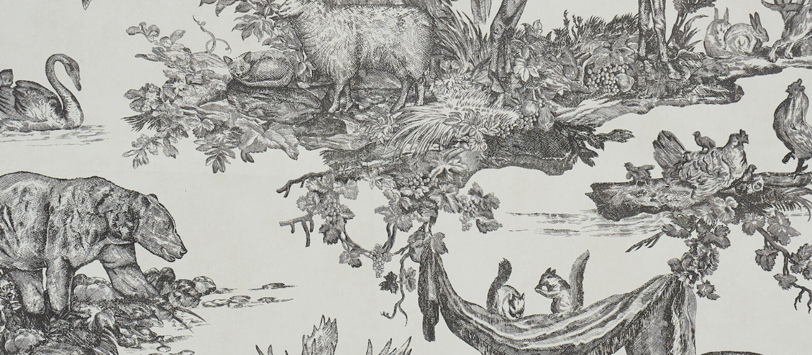
Being a design professional can have its benefits, chief among them resources. The team in the Schumacher design studio recently created a collection called “A Country Life” that used as its compass precisely what I’m talking about: a sense of place. These are fabrics and wallcoverings designed to fit into all kinds of wild settings. There’s a toile featuring a 16-point elk, a print with hunting dogs – a spunky beagle, a basset hound with an irresistibly baleful look in her eyes – a wallcovering flitting with feathers. There’s also a rich, dappled linen, thick with printed leaves, dense with jeweled colors of emerald and faded verdigris as if pulled from some Flemish tapestry, that feels to me like walking through a forest, honeyed with a certain cast of early spring sun, redolent of pine needles and loam and earth. And I know a prickly fading beauty, who I haven’t always seen eye-to-eye with, that I want to make amends to, who’s going to fall in love with it.
Click to read more from the full digital release of Blackberry Magazine, The Muse Issue.