Article
Cool vs. Warm
photos by Ingalls Photography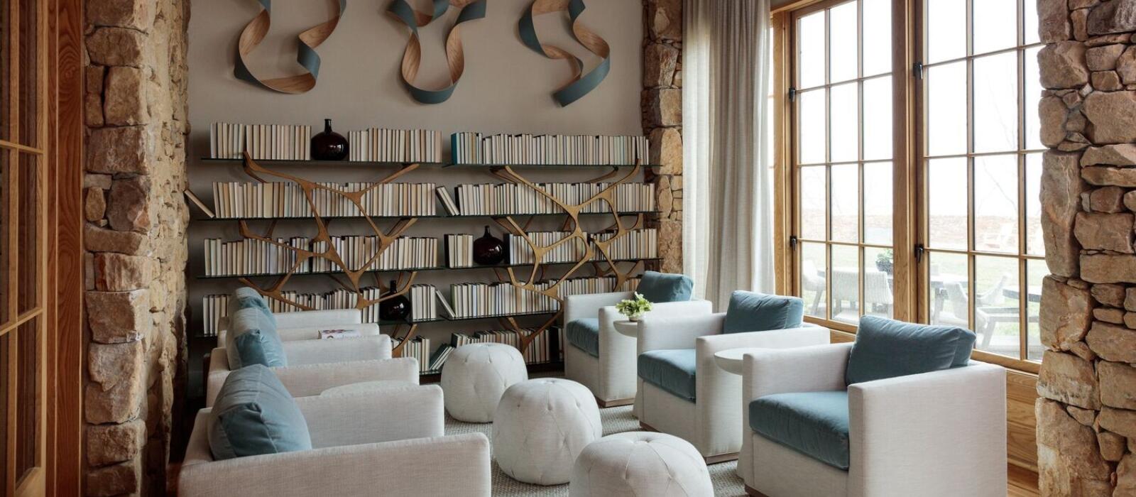
“Color holds the power of transformation,” writes Keith Recker in his book Deep Color: The Shades that Shape Our Souls. Anyone who glimpsed the photos of Diana Vreeland’s poppy New York residence will agree that color implementation in design cannot be taken lightly.
Yet color, in and of itself, is not the only driving factor for making an impact. Consider the rusty New Mexico vistas of Georgia O’Keeffe, and now picture the icier lines of Picasso’s Landscape of Mougins II. Note the emotion conveyed by each artist. O’Keeffe’s sinuous brush strokes of terracotta and chocolate feel like a meditation, while the perkier blues and greens of Picasso bestow a jovial take on nature. Color temperature is at play as much as subject matter.
While understanding color theory, the guidelines that explain color schemes, is something that might merit an MFA, a preference for a certain color is less about the pigment than the energy it exudes, the energy we welcome or reject. Warm and cool colors in decor, words interior designers drop causally, are very personal: One person might gravitate to rich teal paint tones and lemony yellow throw pillows, while another is perfectly content with a gray linen couch and a snow-white shag rug. The choice, more likely than not, is a reflection of who we are at the core.
“What kind of energy do you want the room to have?” Mary Celeste Beall, the proprietor of Blackberry Farm and Blackberry Mountain, asks before embarking on a design project. When she was curating the Lodge of Blackberry Mountain with the Blackberry Farm Design team, for instance, she wanted to create a warm, inviting space with a welcoming feeling as guests lingered for a midday repose or evening cocktail. To do so, the team kept the palette neutral and selected raw, natural materials, like white oak and Tennessee Fieldstone, harvested from the property. To further emphasize that cozy, come-and-stay sentiment, they opted for a lacquered teal on the wood paneling that absorbed the natural light and gave the space warmth and whimsy, without skewing into a dark territory.
To understand color temperature is to touch base with your inner needs and consider the true intention of a space. Before you pick up a color deck, here’s a brief guide on cool and warm tones, as well as design moments that transcend color.
COOL TONES
By definition, cool tones fall into the blue, green and purple territory, though shades of gray and white can exude a coolness when the aforementioned color undertones are present. The psychological effect of this color temperature family translates into calmness. No wonder phrases like “Be cool” and “Let’s chill” communicate a take on relaxation.
“Our clients in Florida use cooler gray and blue tones because they are visually cooling down,” says Jason Bell, director of design for Blackberry Farm Design. “When you come out of that hot environment, you want to feel like you walked into air-conditioning. It’s a psychological trick, but it works really well.”
Yet, to use cool tones properly is to understand how they adapt to light or throughout the
day. A foggy gray paint can look sophisticated on built-in shelving with plenty of natural light, or look cavernous and depressing in a room with few windows and perpetually cloudy weather. When deciding on a blue to paint the ceiling in one of the Holly Glade Cottage Suites, Mary Celeste and team looked to nature, selecting a hue that wouldn’t accidentally impose negativity. Simply put: Look for a blue that won’t give you the blues. In the end, they selected Benjamin Moore Dusky Blue, which didn’t take on a gray look but reflected the sky.
Similarly, the relaxation room at Nest, the spa at Blackberry Mountain, extends the sentiment for tranquility via pale sky- blue chairs. “The velvet gives the chairs texture and warmth, and the blue has a brightness and a calming energy,” Mary Celeste says.
WARM TONES
On the other side of the color temperature spectrum are the warm tones: reds, yellows, oranges, but also beige, brown and even certain shades of black.
Jason loves the earthiness of the Library at Blackberry Mountain. The tufted armchairs upholstered in a teal mohair, sumptuous buttercup drapes and buttery stools surround a chessboard atop a rich wood table – all accent pieces in a cozy wood-clad space with a sandy stone flooring. “The interior envelops you,” he says. “It makes you feel warm and secure, creating an environment you can get lost in.”
That comfort can be conveyed subtly, too. Mary Celeste softened an otherwise angular bedroom with Benjamin Moore Soft White paint, a serendipitous find that revealed itself with its most delicate pink undertone on kitchen cabinets of her mother-in-law’s ’80s kitchen. While the shade was an unexpected surprise in the kitchen, the “nice glow” works wonders for creating a nurturing environment in the chambers – proving that warm tones withstand the test of time.
DECIDING WHETHER YOU’RE COOL OR WARM TONE TEMPERED
While you may have a natural inclination toward a warm or cool color palette, your environment plays a significant role. Mary Celeste looks to nature for inspiration, sometimes even matching her findings, like the moss and foliage, to a color deck.
Jason takes a similar approach, encouraging clients to find a muse in the surroundings. “Look outside the window, and whatever colors you see, whatever naturally happens outside, find a happy marriage to get those colors inside,” he suggests. Seasonality and light also play a significant role in how color shows up. “In eastern Tennessee, the light affects the space differently,” Jason continues, noting that the same paint color can look differently on walls in Florida and New York.
Alternatively, start with a rug, piece of art or fabric you love, and examine the tones of the color palette and build the rest of the interior decoration from there – with a seemingly endless selection of paint colors, you’ll likely find a match with the right undertones for your walls.