Article
A Matter of Materiality
photo by Ingalls Photography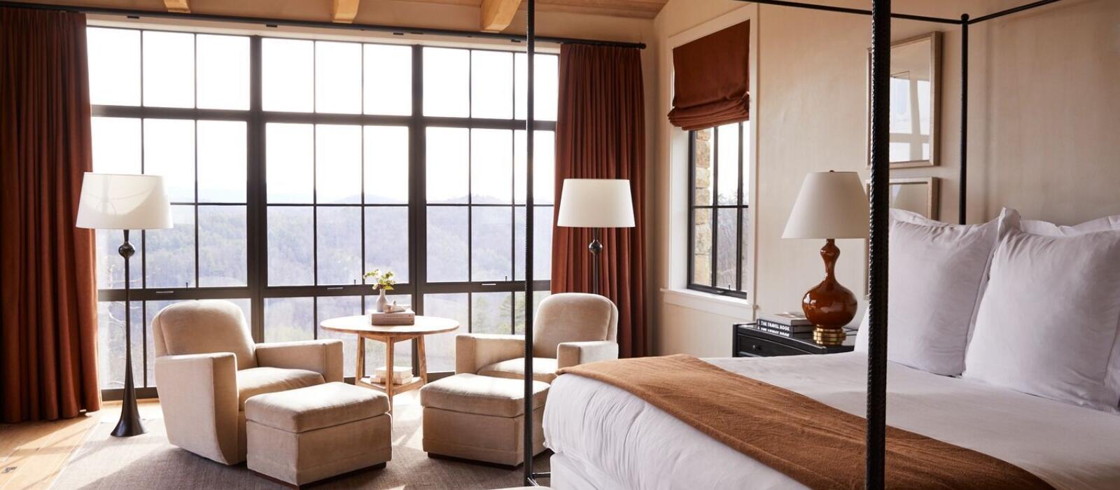
Texture has an interesting and subtle influence on the way color is perceived in a room or a space. Materiality and texture have the power to shift the effect of a color within a room, and we can use that relationship to really manipulate a design to achieve the desired look and impact.
In theory, there are endless shades of every hue that we can use to color an interior. But when considering texture, we see how differently a color might appear in elements of design. For example, imagine a soft and fuzzy red throw blanket, hard and shiny red lacquer or a transparent red glass vase. Although all three are the same color, their effect is quite different – warm and cozy, slick and contemporary, airy and ethereal.
When we see a cashmere blanket, before even touching it, we know how it will feel. As designers, we can use that prescience to predict how a texture and color combination will work within a space. In other words, since we know that the blanket will be soft to the touch, our tactile understanding of that texture influences our perception of the color, no matter what it is, as softer than it might if it were made of a different material. This is how we know that red lacquer won’t make a room seem cozy, but a red cashmere can soften that same lacquer’s hard vibe.
So, if we want to use a bold color in a room, but don’t want it to take over, we can soften the effect without changing the hue. The inverse is just as true. Even white can be made to feel like a bolder presence when used on metal, for example, versus velvet.
In the same way that contrasting colors can energize a room, using differing textures can wake up a space and keep the design from feeling too matchy or predictable. There are endless opportunities to shake things up in design working with the interplay of color and texture.